Role: Lead Product Designer (UX/UI)
Timeline: 6–8 weeks, 2025
Platform: Existing WordPress (Elementor) + Figma design system
Timeline: 6–8 weeks, 2025
Platform: Existing WordPress (Elementor) + Figma design system
From a content-heavy desktop site to a mobile-first experience that drives action across Homepage, Jobs, Connections (Profiles), Events, Courses.
Context & Challenge
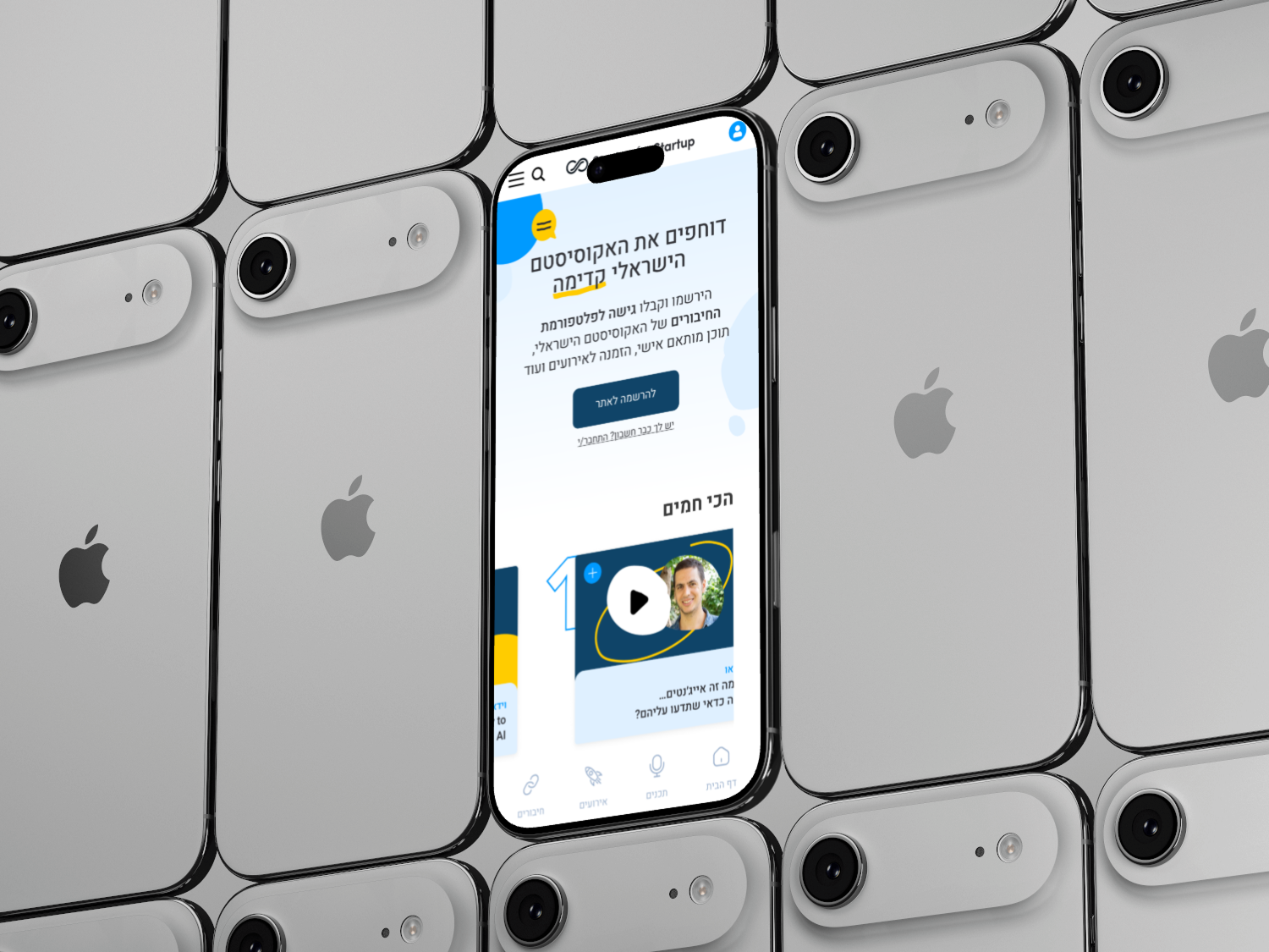
Startup for Startup is an ecosystem of content and community (podcast, blog, videos, courses, events, jobs, connections). On desktop it worked; on mobile the experience felt noisy, with multiple competing goals and no single, obvious next step.
Client focus: Redesign the key mobile pages—Homepage (esp. hero), Jobs, Connections (incl. profiles), Events, and Courses—improving clarity, navigation, and conversion without rebuilding the whole product.
My mandate: Make mobile the primary pathway—clear, fast, and conversion-focused.
My Role & Collaboration
Led end-to-end: research, mobile IA strategy, user journeys, wirefraes, prototype, usability testing, and implementation guidance in Elementor.
Collaborated with the client PM, content/community/events owners, and WP/Elementor developers.
Tools: Figma (auto-layout RTL/LTR, variants), GA planning, remote user testing, Elementor Containers mapping.
Business Goals & Success Metrics
Homepage: Understand the value ≤ 10s and tap the primary CTA.
Jobs: Reduce time-to-first-relevant-job to ≤ 30s.
Connections: Increase click-through to Connect/Message from profile.
Events: Improve Register conversion and ensure “Add to calendar” works across devices/timezones.
Courses: Lift Enroll from course detail.
Key Design Decisions (by Page)
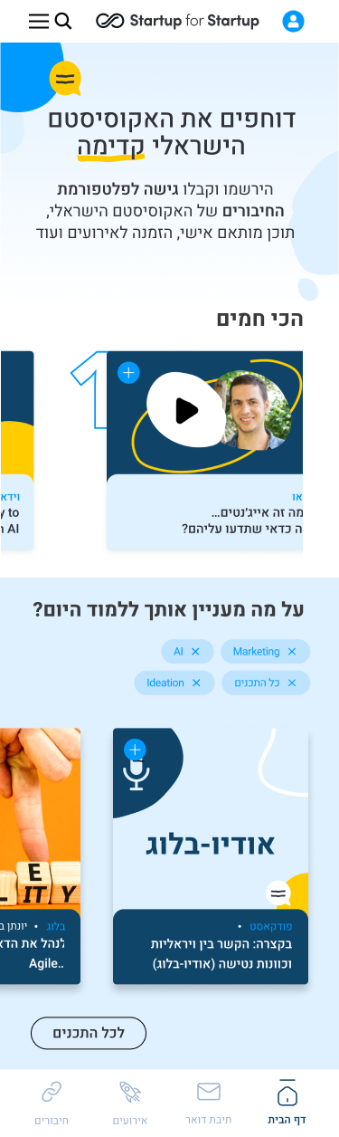
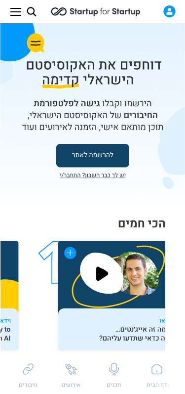
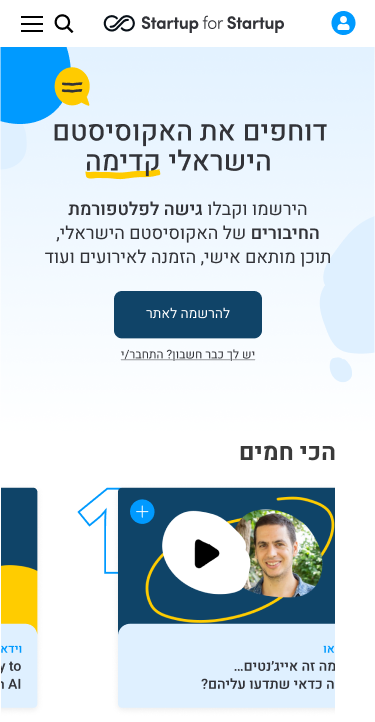
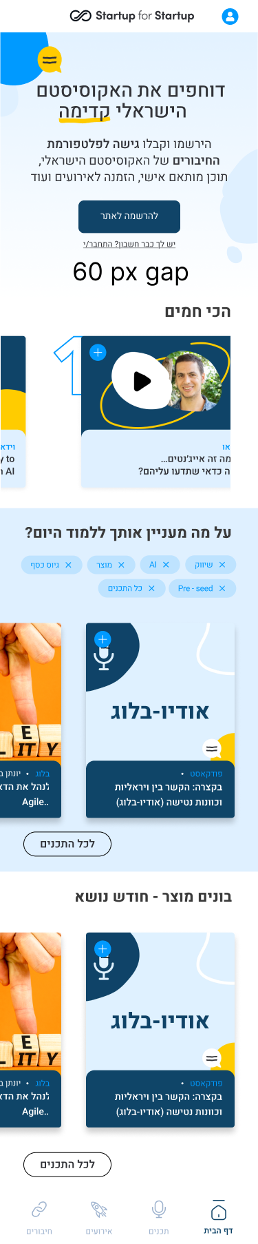
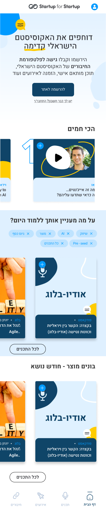
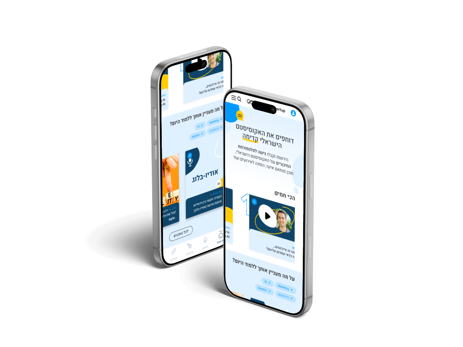
Homepage (Mobile-first Hero)
Short hero + one primary CTA (“Join community” / “Explore events”), with swipe content rails (Events / Courses / Jobs) prioritized by business goals.
Slim sticky header + global search.
Why it works: Cuts cognitive load and makes the next step obvious.
Why it works: Cuts cognitive load and makes the next step obvious.
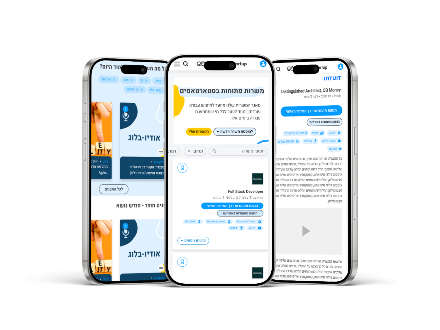
Jobs
Search-first header + Filters as bottom sheet; persistent filter chips.
Compact job cards: logo, role, company, location/remote, seniority, clear primary CTA.
A/B: Inline filters vs. bottom sheet; quick “Remote” chip.
Why it works: Speeds up relevance and improves perceived control.
Why it works: Speeds up relevance and improves perceived control.
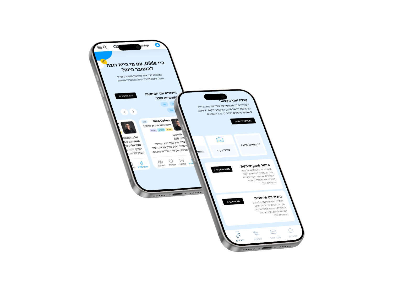
Connections (incl. Profile)
Category entry (Investors / Experts / Co-founders).
Sticky primary CTA (Connect/Message) on profile; collapsible sections (About, Projects, Links).
Why it works: Encourages outreach while keeping scanning effortless.
Why it works: Encourages outreach while keeping scanning effortless.
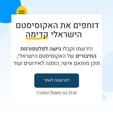
Events
List-first (not calendar) with date-forward cards.
Event detail with sticky Register + robust Add-to-calendar by locale/timezone.
A/B: Image-first vs. date-forward cards; sticky CTA.
Why it works: Minimizes friction on the path to registration.
Why it works: Minimizes friction on the path to registration.
Courses
Consistent course cards (image, title, level) → detail page with Outcomes near the fold and bold Enroll.
Why it works: Shows value before commitment and lifts enrolls.
Why it works: Shows value before commitment and lifts enrolls.
What I Learned
Focus beats abundance on mobile—one obvious path per screen.
Search-first + smart filters reduce cognitive load dramatically.
A sticky primary CTA at decision moments directly improves conversion.
Solid RTL/LTR foundations save weeks downstream.
A clear Elementor implementation map keeps design intent intact in build.